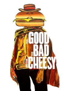
3 Signs Your Ads Remind People of Cheesy Batman Movies
My girlfriend and I made dinner together last night.
After we finished making some awesome chicken jalapeño poppers (I accidentally rubbed my face after I cut up the peppers…NOT fun), we sat down to enjoy our meal in front of the TV.
The movie Batman & Robin (the one from 1997) was on.

Arnold Schwarzenegger as Mr. Freeze in Batman & Robin. Are your ads coming off as cheesy as this?
I hadn’t seen it in years, but it only took a few seconds for me to remember why I like the Christopher Nolan reboot one million times better.
Everything in that version was just… cheesy.
Aren’t Batman and Gotham City supposed to be dark and gritty?
You wouldn’t know it with all the atrocious one-liners and corny costumes.
It was way too cartoonish and try-hard to be faithful to the Batman comics.
Anyways, seeing part of that movie again got me thinking about advertising.
Huh? I have a strange mind…
Hear me out.
I don’t have to tell you there are a ton of cheesy ads out there.
They’re flashing across the webpages you visit, interrupting your favorite TV show, and clogging up your mailbox.
“Cheesy” reminds me a lot of former justice Potter Stewart’s definition of “obscenity” from the Supreme Court case Jacobellis v. Ohio. His definition? “You know it when you see it.”
But what makes an ad cheesy? What’s the anatomy? And how can you make sure you aren’t unwittingly creating those beasts yourself?
Here are 3 signs to look out for:
1) Hype – consumers are willing to tolerate a reasonable amount of puffery when it comes to ads. But cheesy ads tend to get carried away with it. Every time you make a promise your prospects know you can’t deliver – “make six figure in 7 days,” “pick up Victoria Secret models with this brand new cologne,” etc. – you lose traction and potential profits. There’s a fine line between presenting your product in the best possible way without forcing people to swallow silly exaggerations.
2) Relying on big names, big budgets, and expensive production – some ads are cheesy because their creators with large advertising budgets rely so heavily on technology or production value they skimp on the message. But it’s the message that matters more than anything else. Low-tech ads financed on a shoestring budget will beat the snot out of “slick” ads that don’t devote the same focus to the message.
3) Trying to be cute, clever, and/or entertaining – a lot of cheesy ads start out as attempts to entertain people, but they don’t translate the way the ad creators had in the mind. The purpose of an as is to sell (or move your prospects one step closer to buying). It’s cool if your ads turn out clever (these are few and far between), but don’t ever make that your intention. Focus on the bottom line.

People don’t tolerate cheesy ads like they used to, so it’s important to make sure your ads focus on what’s important: sales, not laughs.
There’s nothing wrong with “cheesy” per se. Plenty of cheesy ads have had their fair share of success over the years.
But consumers are exposed to more selling messages now than ever before, so they’re naturally more skeptical. They don’t have time for fluff.
Are you combing through every ad you create with a fine-toothed comb and relentlessly cutting out any detours between getting attention and making your pitch? The 3 signs I mentioned above are a good place to start…
If you don’t show them how what you sell delivers the solution they need right away – and carry that momentum all the way through your pitch – you will lose prospects.
The best use of your advertising budget is to invest in ads that create a direct route between catching your prospects’ attention and getting them to do what you want.
No cheesiness. And no distractions that encourage interested prospects to jump ship.
Direct response principles are the way to make this happen. Things like:
- Compelling headlines to get the right people’s attention and make them want to read more
- Clean sales copy that keeps their attention and turns it into desire
- Features and benefits that describe what you’re selling and how it can help your prospects
- Valuable offers that present your product in a compelling way
- Risk eliminators such as money-back guarantees
- Social proof in the form of testimonials from previous satisfied customers
- Etc.
These things aren’t sexy, but they work. They’ve been developed and tested over decades. Refined until they give you just what you need to make more money: a smooth path between interested prospects opening wallets.
Are you implementing all of these things in your ads right now?
If you aren’t completely sure, get in touch with me here. We’ll talk about how I can use those techniques to create ads for you that deliver the results you need – i.e., more paying customers – without making things cheesy or ineffective.
Remember, substance over style wins out every time.
Substance is what will send you laughing all the way to the bank.
Don’t lose interested prospects by trying to be too witty or clever.
Until next time, keep your “cheese detector” on.