Writing for The Web? Here’s How to Make It Sell
Ads are everywhere now.
Billboards. TV. Mailboxes. Unknown callers on your cell phone (always at dinner). Some are entertaining. A few of them persuade. And none of them are wanted.
People do what they can to ignore them. There are thousands of other ways for them to occupy their attention if your message doesn’t hit all the right buttons.
The pressure is even higher on the web.
But it’s still possible to write convincing copy online, if you keep the following considerations in mind…
It’s Even More Important Not to Waste People’s Time
There aren’t as many pieces of junk mail to sift through as there are spammy websites. There aren’t as many radio stations as there are stupid memes to look at.
Attention is more precious and fragile online than in any other medium. Lose your reader’s interest for half a second, and they’re gone. They’ll find one of your competitors who can keep their attention.
When you’re writing for the web, you have to make every word count. If something doesn’t move your reader closer to doing what you want them to do – whether it’s signing up to an email list, buying a product, or clicking “like” – get rid of it.
This takes work, and requires a painful analysis of every paragraph. But it separates great web copy from all the other websites your prospect will forget about.
Web Copy Red Flags
If something in your web copy doesn’t:
- Identify a problem your reader has that your business can solve
- Build your credibility through testimonials, case studies, social proof, etc.
- Describe your product or service’s features
- “Translate” features into tangible benefits to your reader
- Paint a picture of your reader’s problem and all the good things that will happen when that problem is solved
- Overcome objections to buying what you’re offering
- Remove the reader’s risk through money-back guarantees
- Sweeten your offer with additional value
- Ask your reader to do something (call to action)
- Give people reasons to act now
It’s time for it to go. Make sure every sentence count. If it isn’t pulling them closer to doing what you want, it’s pushing them away.
You Aren’t Here to Entertain, Either
Notice how “entertain” isn’t on the list above. A lot of people trip themselves up here. They think they have to be clever or witty to stand out from everyone else, and they end up pushing away potential customers.
Check out this Subaru ad:
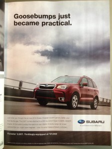
(Hat tip to Ryan Healy for bringing this one up. You can read his blog post eviscerating the headline here.)
Does the thought of “practical” goosebumps make you want to buy a Subaru? Do the people interested in a Subaru even want goosebumps? It’s confusing, and it doesn’t lead anyone closer to visiting a dealership or buying a car.
Save the clever stuff for the multinational conglomerates that insist on wasting millions every year on this kind of stuff. This applies to headings and body copy.
Move your reader closer to doing what you want, and don’t try to get too cute.
You Have to Worry About Appeasing “Scanners”
You can’t scan through a radio spot. Roadside billboards don’t come with a scrollbar. The web is different.
In general, web users have more ability to control their own experience than in any other media. Jumping around a webpage is next to effotless, and most of us have honed it into an art.
These people are called “scanners.” I count myself a proud member of that group.
According to the now legendary Jakob Nielsen study, 79% of web users scan webpages instead of reading them straight through. These scanners dive in and out of content, read sections out of order, and generally jump around until they hit something that interests them.
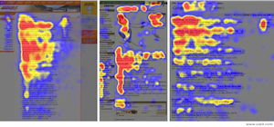
Visualization of human eye movement on webpages.
So, how do you deal with these fly by the seat of their pants types who won’t read your webpage like they would a book?
By making it as easy as possible for them to identify what your website’s about, get them to the information they want, and show them how you can help.
Sounds like a tall order, but we’ll break it down.
1. Use headings, subheadings, short paragraphs and sentences, lists, and visual aides
Basic copywriting stuff here, but it’s crucial you actually implement it online. Learn to love white space.
Divide your content into manageable chunks. This makes it easier for scanners to hone in on the sections of your page that catch their interest. It also encourages them to jump into the flow of your main content without feeling intimidated.
Scanners avoid walls of text like the plague. So should you.
One example of a company that does this well is 37signals. Check out the landing page for their software Highrise.

And here’s their homepage:
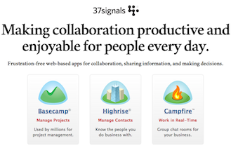
Nice and easy. Scanners can find what they’re looking for right away, and the copy is structured so it’s easy for them to dive in once they do. All they have to do is click a button.
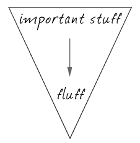
2. Write your web copy in the “inverted pyramid” style
Tell them what the section’s about in the first sentence. Then, elaborate on the main point and offer examples throughout the rest of the section.
That’s what the inverted pyramid is all about.
Check out this great example from KISSmetrics about how Apple does this:
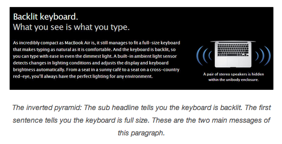
Even if you read the headline only, you understand what the copy is all about. If you’re an interested scanner, you could dive in there to find out more.
Newspapers have been all over this for centuries. Check out this:

No question what this article is about!
And this:

Ditto.
The lead says it all. That’s all it should take.
You know that little “wind up” period when an advertisers on TV or magazines draw you in before cutting to the chase? There’s no time for that online.
Hook them right away. Break it down first, then explain, or lose them for good.
SEO and Search Engines
Writing for the web opens up new possibilities that don’t exist in print. There are keywords, search engines, and the tantalizing prospect of driving free traffic to your website by taking advantage of them.
This is a seductive opportunity for any ambitious person like yourself. But you probably shouldn’t get carried away with it.
Playing nice with the search engines should come second to writing your copy for living, breathing people.
Rearranging your copy, “keyword stuffing,” and other attempts to take full advantage of search engine algorithms risk diluting your sales message so it’s unnatural and unpersuasive.
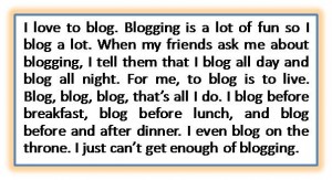
Persuasive, right? This is what happens when you stuff keywords…
What would you rather have: a mediocre message and (maybe) a bit more traffic from Google, or a natural, compelling message that actually converts?
I’d take the second option every time. You’re talking to people, not Google search engine algorithms. Plus, if you focus on creating a persuasive message, you don’t have to stress out so much about the latest Penguin or Panda (or whatever) update wrecking your livelihood.
That doesn’t mean you can’t do anything to make your pages more appealing to search engines. It just means that whatever you do shouldn’t water down the power of your sales message.
Take it from the guys over at Copyblogger:
Modern SEO is all about crafting content so compelling that other people want to promote it by linking to it or sharing it, which increases your trust and authority and helps the pages you want to rank well for certain keywords.
Compelling content is content that resonates with your ideal reader. Focus on creating that, and the search engine rankings and free traffic will follow.
(If you want to see more about basic SEO, Copyblogger has a pretty solid beginners’ guide available for free.)
There’s a Ton of Misguided Pressure to
Make Your Web Copy Short
There’s a weird unwritten law out there that says web copy must be short. It just isn’t true.
While it’s crucial to be succinct and satisfy scanners with plenty of white space, those guidelines don’t necessarily translate into your web copy needing to be a certain length. Maybe people confuse being “succinct” (not using unnecessary words) with limiting the overall length.
Take Conversion Rate Experts for example. CrazyEgg, an analytics company that generates visual representations showing how visitors interact with websites, hired them to increase the conversion rate on their homepage.
Conversion Rate Experts tested an alternate homepage with a remarkably different design:
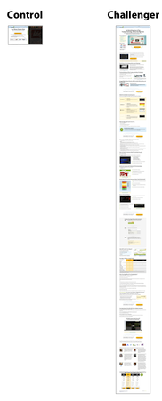
Notice anything different? The second homepage was over 20 times longer than the original, and increased CrazyEgg’s conversion rate by 363%.
This doesn’t mean long copy always outperforms short copy. The only way you can know for sure is to test different lengths and track your conversion rates.
But don’t skimp on important information that could lead to a buying decision out of a concern for keeping your web copy short.
Give people enough information on each page for them to be able to make the decision you want them to – whether it’s buying a product or signing up for your email list. It’s a balancing act, and one that requires a bit of tuning and testing until you hit the sweet spot.
Dr. Charles Edwards, the former dean at NYU’s Graduate School of Retailing, said it best:
The more facts you tell, the more you sell.
Give them all the facts they need to make the decision you want them to make. Nothing more, nothing less.
The Proof Is in The Pudding
The only way you can know what works best for your business is to test different approaches and gauge the results.
Some advertisers have snubbed their noses at the standard copywriting “rules” and still enjoyed enormous success. A lot of it depends on what what you’re selling and who your market is. So keep your thinking flexible and don’t get locked in on any dogma.
A great website design can encourage your readers to trust you and take you seriously, but you’ll need to use the words on your pages to convince them to do business with you.
Don’t obsess over all the beautiful visual elements and shortchange the words. Make sure your web copy:
- Looks good on the screen
- Is easy to scan
- Gets to the point
- Moves your reader closer to acting
And you’ll leave your competition in the dust.
What are some differences you’ve noticed writing for the web? Leave me a comment below and let me know!