Sales Page Mistakes That Cost You Money (And How To Fix Them)
You got people to find out about your business. You got them on your website and showed them how you can help.
Now they’re on your sales page . . .
It’s time to close the deal.
If you don’t do it now, you leave things up to chance. You trust your prospects will come back to you. Most won’t, and this costs you customers and sales.
How come so many businesses do such a great job of getting the right people to their sites, but such a terrible job of convincing them to pull the trigger and buy from them?
A lot of it comes down to having a weak sales page.
Here are some common mistakes to look out for and how to fix them…
Mistake #1: Not Using All The Sales Page “Elements”
Remember in class when those sadistic English teachers made you diagram sentences?
You broke each sentence down into different parts (nouns, verbs, adjectives, etc.), and part served a different function in making the sentence work.
Sorry if I’m bringing up bad memories . . . but a great sales page is a lot like that.
It doesn’t matter if it’s a short sales page or a long one. It doesn’t matter how it’s designed or what you’re selling. Every sales page should include the following elements to turn the most visitors into paying customers.
Are you using all of these?
Compelling Headlines
I know it seems like I’m beating this one to death, but I can’t emphasize it enough: headlines are the most important part of your sales page copy.
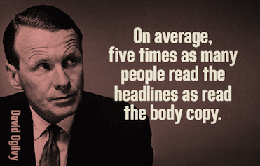
Image source: Intelligent Ink
They can make you or break you, so make sure you choose yours carefully. Keep in mind that the most successful headlines stick to one or a combination of the three following principles:
- They include an implied benefit if the prospect reads further (e.g., “How to Win Friends And Influence People”)
- They point out something new or newsworthy (e.g., “How A New Discovery Made A Plain Girl Beautiful”)
- They arouse the prospect’s curiosity to the point they just have to read more (e.g., “What’s Wrong In This Picture?”)
No need to be cute or clever. When it comes to headlines, that’s usually counterproductive. Check out some of the all-time great headlines to see some of the classic headline principles at work or if you need some inspiration.
Follow these guidelines to make your headlines as solid as you can, but understand the only way to know whether one will convert is by testing it.
Smart marketers are always running A/B split tests on their sales pages to figure out which headline converts the most sales.
Openers That “Set The Hook” For The Sale
After you have a good headline ready to go, it’s time to lay down an irresistible opener to reel the prospect in and hold their interest.
A great way to do this is to use your opener as an opportunity to jump in and engage the prospect “mid-thought.” You jump in with what’s already on their mind.
How do I mean?
Imagine you’re traveling on business. You’re alone at the hotel bar, sitting next to someone you definitely want to meet. You hear her mention something about a trip to Napa Valley when the bartender pours her a fresh glass of wine.
Is it easier to talk to her . . . 1) about the weather; or 2) that trip you took to Napa two years ago? Which approach will make her more receptive?
It’s no contest.
Great openers start with what’s already on your prospect’s mind: the frustration or pain point you can solve. They find common ground and build on it.
A lot of businesses try to “sell” their prospects too early, and they lose people because they jump the gun. You don’t have to do that. All you need to do in your opener is hold the initial attention you got in your headline and carry it further.
A One-Two Punch Of Features And Benefits
Don’t assume that people can see what your business is and automatically know what you can do for them. Spell it out in emotional, compelling detail.
People do not buy things for what they are; they buy things for what they do. – Dan Kennedy
Dan Kennedy is one of the most successful marketing and advertising minds around, charging thousands of dollars an hour for consultations his clients are happy to pay for.
So how come so few businesses listen to him on this?
Why do so many businesses go on and on about everything they “are” without being crystal clear about what they can “do” for their customers?
Beats me.
This is just an extension of solid copywriting principles. Paint a vivid picture of just how different your readers’ their lives could be . . . if only they picked up your product or service.
Note: this doesn’t mean you shouldn’t talk about the different features of your business too. The most compelling sales pages use a balanced approach of features and benefits.
Taming The Demon Of Consumer Skepticism
You might think if someone is familiar enough with you to be on your sales page, that you don’t have to worry much about your credibility . . .
But you’d be wrong. And that assumption would cost you sales and customers you could’ve locked in if you gave your credibility the attention it deserves.
Here are just a few ways to bolster your credibility on your sales page:
- Include strategic testimonials from satisfied past and current customers. Most people use these, but they aren’t strategic with them. Each testimonial you choose should overcome a common objection about your product or service.
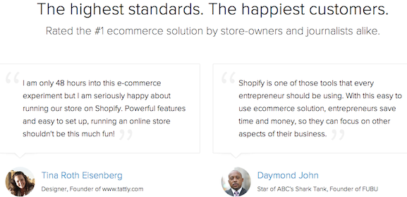
Image source: Shopify
- Take advantage of social proof. People associate what a lot of other people do with the “right” thing to do. If you’ve sold to a lot of people already, feel free to bring that up on your sales page.

Image source: 37signals
- Cite endorsements from authority figures. Go through your happy customer emails and see if you can find any love from authority figures like doctors, celebrities, or thought leaders in your niche. People value authority endorsements… even if the source of the person’s authority has nothing to do with your niche.
- Note any media coverage. If your business got any notable press (online or offline), mentioning the publication and/or including the respective logos adds an air of authority to your sales page that makes it more compelling.

Image source: Shopify
Make A Guarantee: Remove The Risk Of Financial Loss
Got people’s attention with a killer headline and opener copy? Check. Systematically built their interest by laying out your features and benefits? Check. Overcame their doubts about your credulity? Check.
It’s not enough. None of that’s enough.
It doesn’t matter how persuasive you’ve been up until this point. Even if people believe you can help them get rid of their problem, many will hesitate to pull the trigger and buy.
Maybe they got burned in the past by a smooth-talker who didn’t deliver the goods. Or maybe it’s just their loss aversion kicking in. The prospect of a potential loss is more powerful psychologically (some studies suggest up to 2X as powerful) as the prospect of a gain.
Whatever the case, your sales page needs to include a risk-removal element. The easiest way to do this is to guarantee your product or services.
Check out Danny Iny’s sales page from his Audience Business Masterclass for an excellent example of someone with true confidence in his product:
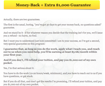
Image source: Audience Business Masterclass
Do you think Danny’s prospects are worried about wasting their money if turns out his product doesn’t deliver? Absolutely not.
One more thing: make the risk-removal process as easy on your customer as possible. Don’t make them jump through a bunch of hoops just to get their money back.
A Value-Packed, “Can’t-Refuse” Offer
Now’s the time to put a bow on this thing and close the deal.
Lay out all the solutions and benefits your prospect will get if they buy from you. Describe everything your prospect gets out of the deal before you name your price. Emphasize the massive financial and emotional value your prospects will gain if they take you up on your offer.
Here’s a great example:
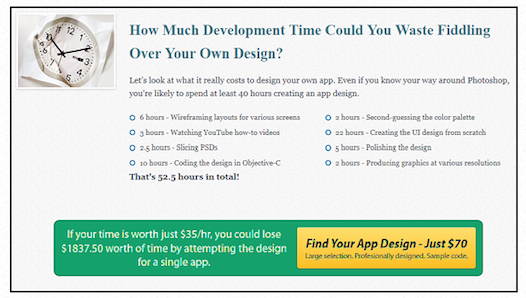
Image source: Unbounce
It doesn’t matter how expensive the product or service you’re selling is . . . as long as people feel like they’re getting the better end of the deal.
You can convert even more customers by “sweetening” your offer with a premium or upgrade. This is a free “bonus” you’re willing to throw if they take you up on your offer, and it’s often enough to push people who were on the fence to buy.
If you’re going to go the premium route, the best upgrades or add-on are:
- Related to the original offer; and
- Valuable on their own, to the point where you could legitimately charge money for them
Note: if you use all the conversion-booting tips in this article and still aren’t selling like you hope, your offer is probably the culprit. Great copy can’t create desire; it can only channel it in the right direction. So focus on adding more value to your offer until it’s irresistible.
Idiot-Proof Calls To Action
You lay out all the benefits, make a great offer, and it’s obvious to your prospect that doing business with you would be in their best interest . . .
So, how come you aren’t converting mor customers?
Take a look it: 1) if you’re asking people to take you up on your offer; and 2) how you’re doing it.
Imagine two people who like each other. One says, “We should go out sometime.” The other agrees. “Yeah, that’d be nice.” But there’s no follow through. No concrete plans for a date. What are the odds of this thing working out? About 0%.
“Great. I’ll pick you up for dinner Friday at 7,” is much better . . . and infinitely more likely to lead to the outcome they both want.
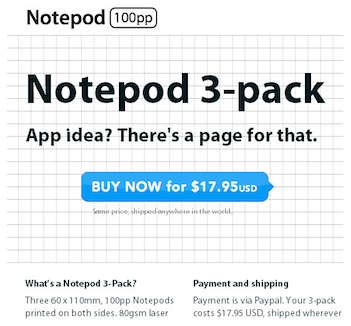
Image source: Smashing Magazine
In sales page terms, this means asking your prospect to take you up on your offer and explaining exactly how you want them to do it (“click the yellow button below to download the guide,” for example).
A Legitimate Reason To Act Now (If You Can)
If you can give people a legitimate reason to buy from you now, do it.
Too many businesses create a false sense of scarcity. Their sales page says they only have a “limited number” of downloadable files available. But their would-be customers know better, and they don’t appreciate being treated like idiots.
If you’re doing a product launch, you could offer an introductory price or a cool premium for a limited time period. The only caveat with this: you actually have to raise your price (like you said you would) when you reach your deadline. Don’t go back on your word, or you put your credibility and conversions at risk.
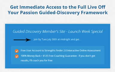
Image source: Become A Blogger
A reason for your prospects to act now is great, but it might take a bit of creative thinking to come up with a legitimate one.
Mistake #2: Getting The Sales Page Elements Out Of Order
Okay. You make sure you’re using all the elements laid out above. You went over everything (twice) and put together a great offer. You’re ready to rake in those customers . . .
But there’s something else you need to do first.
A great sales page has to flow in a certain order to maximize its persuasive effect. It’s like a movie or a dance; you can’t just jump around and hope everyone loves it at the end.
Does your sales copy read in a way that takes your prospect’s desire, channels and intensifies it, overcomes objections in a systematic way, and closes the deal?
Sounds like a tall order, but Dan Kennedy has your back. Check this out from his book The Ultimate Marketing Plan, where he goes through the five steps of a successful sales presentation:
Step 1: Awareness of need/desire
Step 2: Picking “the thing” that fulfills the need/desire
Step 3: Picking the source for the thing
Step 4: Accepting the source’s price
Step 5: Finding reasons to act now
A great sales page is just an “online version” of this sales presentation format. So you can use Kennedy’s five steps to structure your page in a way that converts the most customers.
If this is tripping you up, just imagine how you’d sell your product or service if you had to do it door-to-door. That’s what your sales page should feel like to each person who reads it.
Mistake #3: Actually Caring About The “Long-Form” Vs. “Short-Form” Debate
“How long should my sales page be?”
This one drives me nuts. The debate on long-form vs. short-form shows no signs of letting up. Which is dumb, because it’s a silly debate to have in the first place.
Consider this nugget of wisdom from Peep Laja at ConversionXL:
The amount of copy you need depends on the complexity and cost of the product. The more complicated and/or expensive the product, the more you need to explain, show, educate, convince.
If you’re selling a box of matches for $0.25 – and I need one – I don’t need to read any copy. I just buy it. The product is simple and cheap.
On the other hand, if I’m on the market for a new car or a house – both complicated (many things to learn about them) and expensive – I will take weeks and months to do research, read and compare.
If you’re selling something that costs say $300 – I don’t need weeks, but I do need an adequate amount of information before I can justify (to myself, to my wife, to my boss etc) such an expense.
Couldn’t have said it any better myself. And anyone who tells you one way is “better” than the other doesn’t know what they’re talking about.
So you can safely remove yourself from the long-form vs. short-form debate. Practice your politician’s handshake, because the best way to clear this one up is the following answer:
“It depends.”
It really does. Your sales page should be long enough so people can find out everything they need to know to buy your product. And don’t worry about boring the more impulsive types. They can skip ahead to the bottom, if that’s what they want to do.
The only way you can know what will convert the best for you is to test. Which is cool, because it means you have options to increase your conversions that you might not have known you had before!
A lot of the stigma about long-form copy comes from the fact that a bunch of the people who use it don’t pay any attention to the design.
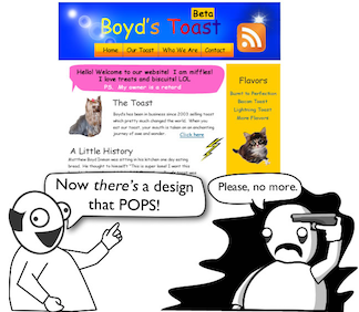
But if you incorporate a long-form sales page into a sensible design, you can dramatically increase your conversions. Check out this epic free infographic by Joanna Wiebe at Copy Hackers if you need help.
Mistake #4: Neglecting Copywriting Fundamentals
Even if you have all the elements and they’re in the right place, your sales page won’t sell as much as it could if it neglects copywriting fundamentals.
So it’s crucial to keep the fundamentals of writing great copy in mind…
Use subheadings to satisfy scanners, break up text, and summarize the important information that comes next.
Write like you speak. If you have trouble with that, record yourself talking about your product or service, play it back, and transcribe it!
And white space rules. Don’t bog your readers down with walls of text. Use short words, short sentences, and short paragraphs.
Consider other ways to break up text on the page: lists, quotes, tables, and charts. You can also use images, as long as they don’t distract people and relate to your sales page narrative.
Can Your Sales Page Make You More Money?
I’m confident that it can . . .
But there’s only one way to find out. Take a look at your sales pages. Take note of where you might be leaking sales, and make some tweaks. And don’t forget to test and track the results!
It’s time well spent. A killer sales page will pay off for you again and again. Cha ching.
Happy conversions.
I put a lot of time and effort into this article because I wanted it to be a “one-shop stop” resource to help you supercharge your sales page. How’d I do? Which of these techniques have you used to convert more customers? Leave me a comment below and let me know.
