The Zen of White Space and Writing Better Copy
I want to talk to you this evening about a very special lady.
She doesn’t think much of herself.
Actually, she thinks she’s a bit of a nerd.
You’ve seen her thousands of times but she has one of those faces that make her . . . blend in to the background.
I’m sure you know what I mean . . .
Well, this humble little lady is actually a stunner. You just need to look at her in a different light.

Ms. “White Space”… isn’t she beautiful?
I’m talking about white space.
When you’re trying to squeeze your copy into a limited space, it’s tempting to overlook white space in favor of more information about your product or service.
I just want to add this one more detail about my product, you think. And so begins a chain reaction of longer paragraphs, typography tricks, and abandoning “wasted” white space whenever you possibly can.
All for the sake of jamming in more info about whatever it is that you’re selling…
This is tempting, but it’s also the obvious choice. It’s a lot like chasing after the captain of the cheerleading squad.
Every other guy is already doing that. And, even if you manage to get the girl, she probably won’t live up to the hype that’s in your head.
It doesn’t matter how informative you make your copy. It doesn’t make a difference how many bullet-points you include.
Not if people stop reading. Because when people stop reading, you LOSE.
People generally follow the path of least resistance . . . especially people with zero investment in your advertisement. Walls of text packed into tiny areas looks like work . . . so people will shy away from them.
With that in mind, let me urge you to consider pursuing another prom date: Ms. White Space!
She separates complicated ideas and breaks your copy into digestible, easy-to-read chunks.
She makes your pitch flow so people find their eyes at the bottom of your ad without knowing what happened.
And she makes you write better copy because she forces you to be selective about the info you include in the limited space you have.
O.K. I’m going to stop while I’m ahead. I wouldn’t want this to turn into a sequel to She’s All That…

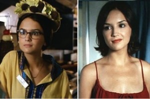
Laney Boggs: from dorky art student to prom queen…
Too late?
You get the idea, though: white space is your girl.
You just need to go into the library where she works and convince her to let her hair down . . .
P.S. How do you make your copy easy to read? I’d love to hear your ideas. Leave me a comment and let me know!